Friday 8 April 2011

Project Evaluation

NOTE TO TUTOR, the final outcomes shown below feature the copy "1350- tailored by Umbro," as required by the brief. This copy is missing on the files I submitted to the hand-in folder, due to an error on my part where I submitted the wrong files.

Overall, I am thoroughly happy with the Ad campaign I have produced. While some aspects of the campaign could perhaps be a little better, I am fairly confident with how I have portrayed the themes. The only things I would change about my campaign looking back, are the use of brand logos. While I am most happy with how I have designed the Nike spoof poster, I think the Reebok poster, in terms of imagery, is perhaps the weakest, mainly because it is only the brand name I have changed, whereas the brand marque has remained the same, so it could be seen as an actual Reebok poster, although I think due to the copy I have placed on the poster & the inclusion of the Umbro logo are enough to get the message across that this, and the rest of my posters in my campaign, are "Anti-every-other-brand." Looking at my campaign I think it succeeds in appealing to the 18-24 demographic, as this age group can relate to the language used, and also with the brands being spoofed in the campaign, so this empowers the audience as they can relate to what is being shown. The only problem I have with my campaign is that I don't think it really puts a lot of emphasis on the "1350" theme. While this theme is clearly visible in the copy, I think the actual concept needed a little work, perhaps done a different way it would have ticked every box, but I think the way I have put across my ideas visually only brushes the surface of the "1350" theme. Other than that, I am very happy with my outcomes.

Thursday 7 April 2011

Final Outcomes

So, here are my three final poster advertisements. As seen in the image, I have gone for three memorable mottos or slogans for each poster. "Don't Do It" as opposed to "Just Do It" for Nike, "Rethink" as opposed to Reebok, and "Three Stripes And You're Out" for Adidas. I'm hoping I've made these different enough, even through using some other brand logos, that they look more like spoofs or plays on other brands as opposed to actual adverts for them. The accompanying copy to each motto is the same throughout each poster to provide a unified look & the copy reads "You've got 90 minutes to show your skill on the pitch & 1350 off it. Don't look a mug. Choose Umbro A-Frame." I've done this to focus on the "1350" theme of the whole ad campaign, using the kind of talk the 18-24 year old demographic is familiar with & uses, while at the same time tying in the accompanying copy to the slogans themselves, by "Not doing it" or "Rethinking" you're not choosing other brands, you're choosing Umbro, and you don't want to "look a mug" wearing other brands, such as Nike, Reebok & Adidas.

Finalising Ideas

Since my ad campaign is mainly focused round spoofing other brands, I've decided to choose the "Big Three" brands to make fun of in my posters. I've twisted the Nike spoof round enough so that it looks like a spoof rather than an actual Nike ad, same with the Reebok poster, but when it came to the Adidas poster, I struggled a little, at least imagery wise. I've stuck with the "Three Stripes & You're Out" motto as that definitley works, but I tried placing the Adidas logo on the poster & it just looked like an Adidas campaign, so I've come up with an image that plays on the iconic Adidas three stripe logo, but also keeps with the theme of avoiding other brands & only choosing Umbro. That is the image shown here, a simple red circle with a red line through it, commonly seen on road signs, or to show something is banned or forbidden. In this instance, I've added three lines instead of just the one, in order to create a sort of visual pun, without prominently featuring the Adidas logo. This works in my opinion as Adidas don't just used their iconic logos anymore, they also use 3 simple straight lines, so the audience should be able to recognise this instantly.

Friday 25 March 2011

Don't Do It!

Just so I knew how the rest of my poster ads would look, I quickly mocked up, basically what my "Target: Nike" poster would look like. I had the idea at first to form an "X" from the two Nike ticks by flipping one horizontally & crossing them over each other, but this looked more like a coat of arms or a pair of swords as opposed to a cross, so I went with the idea of turning the Nike logo upside down, as turning things upside down is often interpreted as negative (i.e turning a countries flag upside down). Combined with the slogan "Don't Do It", I think I've created a pretty effective poster here, although it still needs a bit of neatening up. I'm fairly happy with underlying theme, highlighted in the copy below the main slogan. "Don't look a fool in your 1350 minutes off pitch. Choose Umbro A-Frame." I think this ties in well with the 1350 concept, not just because it mentions it by name, but also because the main theme of these ads focus on social standing, which is somewhat of a big deal amongst people off pitch. This theme also applies to the 18-24 year old demographic, as the target audience can not only associate with the brands being spoofed, but also with the perception of people themselves based on what they wear.

Wednesday 23 March 2011

Rethinking...

Just in case the whole "Reebok-Ret*ard" slogan doesn't really work (which it probably wouldn't in the real world of advertising) I've come up with an alternate slogan; Rethink. Once again though before finally deciding on a slogan for this one, I'll need a bit of tutor input to steer me in the right direction... Get ready for a flurry of blog posts on Monday once I have a clear idea in mind.

Getting back into shape...

After having a couple of brainstorms overnight as to how I can successfully pull off this ad campaign, I've decided what I'm going to do (with a back-up plan if necessary). Using the logos of other brands as my imagery, my main theme will be completely typographical, using witty puns & slogans. I'm fairly confident about the ideas I've had, but I'll need to clear them up with my tutors on Monday just to make sure they will work, otherwise, back-up plan it is. The three brands I've decided to "target" in my ads are Adidas, Nike & Reebok. I think I can cleverly devise some sort of pun-driven slogan to put my campaign across, but the Reebok one in particular is the one that concerns me, mainly because of how controversial it is, as you'll see from the image. I'm positive this is the direction I want to take, but I think a bit of tutor input would be nice at the final stage, just so I can clean my designs up & prepare a final outcome. I'd also like a bit of advice on whether or not this theme still ties in with the whole "1350" concept.

Tuesday 22 March 2011

Pete Tong.

As the title reads, it seems this whole concept has gone completely t*ts up! I've really been struggling to find the right way to pull off this advertising campaign & I think this project has seen me come up with the most ideas for one outcome. I'm really going back to basics with this one as I've been totally unable to execute my past couple of ideas properly. I'm going to work my backside off this week & next in hopes of really pulling the whole "Three Stripes & You're Out" concept off & getting back on track with that, as I think it's definitley been my strongest concept so far. On the other hand, I've had a couple of issues with how to pull this campaign off design-wise, so if push comes to shove (which at this late stage, it probably will, I'm going to have to really go back to basics & just do a simple campaign that really hammers home the whole idea of "1350 minutes." Not what I'd hoped for, but I really don't see any other option. Based on the problems I had with the "Brand War" campaign before, I think I'm going to have to make this one completely typographical if it is to work, with some witty copy below the main type, just to get my messages across. Totally ballsed this one up, and I am NOT happy about it. This is what happens when I think too much.

Friday 18 March 2011

Conversational Typography

Going back to a post I made a month or so ago, I've decided to look at kinetic type again. I don't intend to produce a kinetic outcome, but what I am going to do is create typographic slogans using "banter" about the Umbro A-Frame. Although I was really behind the idea of "Three stripes & you're out" etc, I was really struggling to make the imagery & type interact, so instead, my aim is to make my campaign entirely typographical. The reason I have looked up kinetic type in this instance, is because there are a lot of typography videos on the net, based on conversations & lines from films etc, and even though the type is moving, there are some interesting layouts to be seen & that could serve as inspiration.

Changing (potentially) Ideas

Looking back at the slogans & design outcomes I had intended to come up with, I don't think they will look visually effective if I do them the way I have discussed previously. I am at a stage now where I prefer the idea of my designs more than I like how I am going to nail them. I've had a brainstorm of a few other ideas & am confident with the one I have now come up with. More on that later.

Friday 4 March 2011

Creating Links

Elaborating on my previous concept, I have opted to feature the crowd visual encased inside the Adidas logo, in order to make the pun more relevant. I think this works better as a connective between visual & typographic message, however I am not convinced that the link is still there between the pun & the 1350 concept. What I think would work more successfully is some sort of visual showing someone standing on their lonesome outside a club or bar, clearly looking as though they have been rejected from said place, in hopes to make the pun more relevant to the image. This is something that is going to need a lot of work if I am to get absolutely bang on.

Development stages

Now I am confident about my idea & know roughly where I want to take it, I've begun to look at how I can develop both the "1350" concept, as well as my own ideas. In this rough poster concept, I have combined elements of both of these. The main visual shows 3 stripes, followed by the slogan "Three Stripes & you're out," continuing my pursuit of a sort of "brand war" between Umbro & other leading sports brands, the target of this design of course being Adidas. I have accompanied this visual & slogan with a sub-line of "Umbro A-Frame. For life off the pitch." And the main visual focuses on some sort of concert or performance, highlighting the past times & activities explored during the 1350 minutes spent off-pitch. I am not entirely convinced that these elements connect though, as there is no real connection between the "Three Stripes & you're out" slogan & the main visual. The idea behind the slogan was to get across that these particular shoes were THE shoes to get you "in" & the "three stripes & you're out..." tagline was supposed to reinforce this, subtly hinting that Adidas was inferior. I think the two elements I have combined in this design can, and more than likely will work, just not together.

Umbro.com/1350

While looking further into the existing 1350 ad campaign for Umbro, I stumbled across an official site for the campaign (www.umbro.com/1350). The site heavily focuses on Peru captain Juan Varga & Aston Villa/England player, Darren Bent, both who have a strong passion for tattoos, which appears to be the theme running through the 1350 campaign. While this is definitley one way of approaching the concept of 1350, I don't think (in my opinion anyway) that this campaign is particularly successful. In my opinion, this is because the campaign is centered around two players & one particular off-pitch past time, which I don't think reaches as many audiences as it probably could or should. I think this campaign should have been approached with a more diverse outcome, aiming & looking more at other off-pitch activities & if not the general public, at least more than two players, as to show more diverse aspects of the 1350 concept.

1350

So, one of the main driving forces behind the ad campaign I'm working on at the minute is the concept of "1350." These are the minutes left in a day, minus the 90 minutes spent on pitch playing football. This what I aim to explore in my designs, highlighting popular past times & activities carried out during the 1350. Umbro's pre-existing ad campaign, using the 1350 slogan, does something similar, showing how Peru team captain Juan Vargas spends his time off pitch, getting tattoos. Other posters in this campaign also look at other players getting tattoos, so I am assuming this was a running theme throughout the initial run of the 1350 campaign. This particular ad campaign is far more in your face & to the point than the ad campaign I intend to conceive. I hope to bring a much more heavily focused typographic approach to my campaign, with a more subtle approach towards imagery. My design will also be more public-based, looking at popular past times of the general public, in an attempt to reach a wider audience.

Tuesday 1 March 2011

First attempt...

Here is my first attempt at presenting one of my slogans typographically. Although I've tried to stay away from direct links to Football, the typeface I have used looks particularly sporty, like the type of American, high-school type you see on Jock jackets. I've done this to try & reach out to the 18-24 demographic, keeping it looking neutral though, so it doesn't just appeal to the 18's. Whether or not this will work or not I don't know, but I have also made it blatantly obvious which brand the slogan is taking aim at, by placing more subtle type beneath the main slogan, almost as though Adidas are being talked about on the quiet. The use of "smileys" using punctuation also appeals to the younger audience, as this is something commonly used amongst youngsters via text & social networking sites, which once again will empower the audience as they will feel they can relate to the ad itself.

Tagline Suggestions

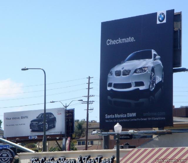
The infamous Audi-BMW ad campaign war.
Now I'm going to be taking an almost "pun" approach to my designs, it would be wise to come up with a few suggestions for a slogan or two. In an attempt to form some sort of witty banter amidst my campaign, I thought it would be visually interesting to take aim at opposing brands, similar to how BMW, Audi etc ran similar ad campaigns. My aim is to "slag off" for lack of a better term, other sports brands such as Adidas & Nike, with taglines making a play on words towards other brands' popular slogans, i.e "Don't Do It" as opposed to "Just Do It" for Nike, "Three Stripes & you're Out!", aimed at the Adidas logo etc, etc. Using taglines such as this will appeal the 18-24 year old target audience in my opinion, as they will feel empowered as they "get it" in terms of the joke. They can relate to brand wars, as they themselves are constantly feeling it necessary to keep on top of the latest trends in an attempt to be "in", hence the "Three Stripes & you're out" tagline in particular, making the demographic that these particular Umbro shoes will get them where they want to be in terms of trend.

Monday 28 February 2011

Entering the Design Phase

I'm now confident enough with my idea to push forward with it in terms of design. My main aim, as stated in previous blog entries, is to avoid as many links to football as I possibly can, which means placing elements of Umbro advertising as well as the product being advertised into my campaign. My initial idea was to produce a photography based outcome, showcasing the "A-Frame" shoe in various off-pitch situations, i.e a businessman walking down the street with his briefcase, looking swanky in his suit, but wearing the A-Frames, all in an attempt to show how the shoes are worn off the pitch. After consultation with my tutors, I've decided to set this idea on the back burner & use it as a potential back up in case my new idea doesn't work. My idea now, is to focus on youth culture (clubbing etc) & how appearance means everything. You are often turned away from a club for what you are wearing, so to promote the A-Frames in a positive & fashionable way will encourage people to wear these shoes wherever & whenever. Witty taglines & slogans are also needed, which could be done typographically & the idea of "slagging off" other brands in favour of Umbro is sticking out to me. Lines such as "Three stripes & you're out" & "Don't do it", aimed at brands Adidas & Nike tie into the witty banter shared between brands, and the people that follow them. You are often labeled for the brands you choose to wear, which is something these brands tend to play on & could work well as a design if executed properly.

Mixing it up 2!

Although this advertisement is somewhat of a contradiction to what I aim to do for my own ad campaign, I thought the use of imagery, and the contradiction that the imagery itself conveys was rather effective. Once again created by design agency Aldea Santiago, this particular ad (and the series that follows it, have a look at them here: HERE) shows groups of people playing football, but on or in other sporting venues such as an empty swimming pool, tennis court & basketball court, which I think is really effective as it shows how football appeals to everyone. Although as I said, I wanted to avoid any direct football links, I think this ad campaign is one of the most clever & effective I have seen so far.

Mixing it up...

Once again, while browsing the net, I came across another ad for Umbro, which perfectly sums up the approach I want to take with my own design. Again, I want to avoid as many links as I can to football in my campaign so that the shoes I am advertising can appeal to a number of audiences. This particular ad was created by the agency, Aldea Santiago & was released in 2006. At first glance, the ad looks nothing like what you would commonly expect from a sports brand & I think it is advertisements such as these that are the most successful. The product placement in this ad is almost subliminal. Extremely subtle, which is what I think makes this advert a good one. The use of imagery in this particular ad really sets it aside from Umbro's usual approach in my opinion, which is exactly what I aim to do in my ad campaign.


Out of the Ordinary

Now I need to enter the design phase of the project, it's probably best I start to look more in depth at existing ad campaigns for inspiration. Since I want my poster ads to appeal to a wider audience than just football fans, it would be nice to come up with a concept that breaks the mold & walks away from the football fan stereotype that Umbro has built itself up to appeal to. Browsing the interweb, I found this rather interesting ad by Umbro. While I'm not entirely sure of the message this poster is trying to put across, I quite like the idea. It's almost as though Umbro have taken their advertising out of it's comfort zone, placing a football player somewhere other than a pitch. This is the kind of approach I want to take with my ad campaign, taking an otherwise football-targeted brand & doing something completely different with it. This includes utilizing different components than a footballer, football kit & football pitch & replacing it with something different & perhaps unassociated with football, with the only link to football in the ad being the shoe being advertised.

Monday 31 January 2011

Banned Umbro Commercial

Here's a pretty funny, but apparently banned Umbro advertisement. It just goes to show that Umbro really do define football gear.

Appealing Imagery...

Looking into other footwear manufacturers, such as Reebok for example, I can see why some of their ad campaigns are so successful...
The use of rather appealing imagery to promote the "Easytone" range would obviously be a big hit amongst both genders, women would look at this advert & be suckered into purchasing these shoes to get a pretty fine backside & the lads would just ogle over the poster, not particularly with the intent of buying them for themselves but maybe for their wives/girlfriends. In regards to the ad itself, I like the context in which the shoes are being advertised, this is something I would like to incorporate into my own ad campaign. The surroundings are very relaxed, laid back & give the impression these shoes can be worn where ever, whenever, which is exactly what I want to put into my posters to promote the "A-Frame" range.

Friday 28 January 2011

Umbro's Approach

From what I gather, most footwear advertisements, particularly those centred around football, regardless of the manufacturer, always tend to play on the football factor. Reading the brief, it looks like Umbro want to promote this new range of footwear not just for footballers/football fans. Umbro are very well known for their football products, and have been for many years, and as previously mentioned, their prior ad campaigns tend to be aimed more towards a football audience, so creating a new ad campaign that strays away from that may bring something refreshing to the brand & offer up a new perspective.

Supporting Visuals

After downloading the brief pack for the Umbro project, I found a folder full of supporting visuals, these high-res images are going to be useful for whatever design I decide to do. More than likely I will be going with a poster campaign, even in today's world of the internet, iPads & other gadgets & gizmos, I still think poster campaigns are one of the best ways of promoting & advertising. There are a number of possibilities in terms of what I can produce, and these visuals are going to help in a big way!

Choosing a Brief

After several discussions during sessions & spending way too long trying to decide on a brief to work on, I've decided to go with the Open Advertising "Umbro" brief. I can honestly say none of this years D&AD briefs have really jumped out at me with the "wow" factor needed to really want to pursue a brief, but due to the fact this brief is an open one, I feel like I have a number of opportunities as to what I can produce in the way of an outcome.

Friday 21 January 2011

Let the fun begin... Again!

This is my first post regarding this years D&AD Project briefs, I'm still undecided as to which brief I'm going to choose, but I have narrowed it down to the Umbro & Aviva projects, as these are the only projects that particularly appeal to me, none of the other briefs provided me with the usual creative spark I tend to get when scanning through a project outline.